CCLEANER
Number-one tool for cleaning your PC.
Category_
Product Design
Year_
2021-2023
Website_
www.ccleaner.com
CCleaner protects your privacy and makes your computer faster and more secure by cleaning unwanted files from a computer.
CCleaner is one of the longest-established system cleaners, first launched in 2003. It became more popular, with over 2 billion downloads.
— My duties —
I’m responsible for the design of CCleaner desktop and web-based apps by collaborating with the Project Manager, UX designer, User Researcher, UX Writer, Developers, Data analyst, Support team…
Develop the CCleaner Windows App, support the brand, and help establish processes, design discipline, and design system.

- Case study 1 -
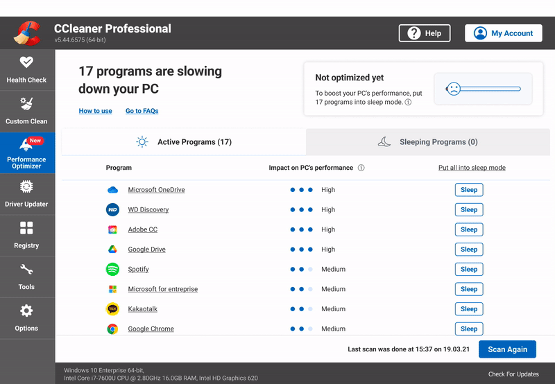
Performance Optimizer
A new feature in the CCleaner Windows App.

High-level goals
From a user perspective, the new feature will provide the performance gains that the CCleaner Pro users expect from the product.
From a business perspective, adding value to the product will increase the conversion rate and renewal to CC Professional.
SOLUTION
CCleaner app launched a new feature called ‘Performance Optimizer’.
PC programs can consume precious processors, memory, or internet resources, even when you’re not using them.
The feature allows the user to ‘put into sleep mode’ unnecessary programs to free up speed and improve general performance.
Process overview
The team collaborates to list the user problems, the feature functions and the milestones.


- USER RESEARCH -
With the help of the UX Researchers and the support team, we synthesised the primary user’s problems.
The UX Researchers organised a few user interviews, and the support team shared the main feedback with our team.

- BRAINSTORMING -
Our objective is to improve the user experience with our product. At the end of the session, we highlighted our potential points of action: Transparent communication | Positive value | Empowering the user

- BLUEPRINTS FROM THE USER & TECHNICAL PERSPECTIVE -
The service blueprint provides the following:
- An overview of each stage of the new feature with flow and interactions.
- Back-end data inputs to provide specific data needed by the front-end.

- MILESTONES -
List and rank each objective with the team.
In collaboration with the team, including the PM, Developers, QA, and Data Analyst, we listed the Performance Optimizer functions and our milestones.
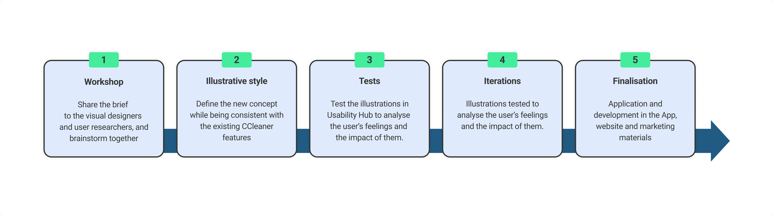
Design Process
The main objective is to focus on the users' experience at each stage of interaction.

- COLLABORATION ON FIGMA -
Ideation sessions across various features and key user touch points are made collaboratively.
Explored various design directions, allowing us to test later and see which design best solves the problem.

- LOW-FIDELITY WIREFRAMES -
Following the validated user flow, the low-fidelity wireframes are created to visualise the requirements and get the team on the same page early on. The UX and UI follow the same design patterns as the other features to be consistent across the app.

- TESTING THE FEATURE -
The UX, UI, and Writings on Usability Hub have been to get feedback and make beneficial improvements.

- HIGH-FIDELITY WIREFRAMES -
The high-fidelity wireframes are created based on the validated low-fidelity wireframes and following the test report.
Feature’s name researches
13 names are tested in Usability Hub. The testers choose the name that best suits the feature.


Art direction
Research the illustrative concept to represent the new Performance Optimizer feature while being consistent with the rest of the app.
Workshop & Brainstorming objective:
Find a concept to illustrate the new feature.
The creative workshop aimed to discover the best way to illustrate the Performance Optimizer feature. I led the collaborative session with the visual designers and researchers to explore visual concepts representing each onboarding stage.


Refining the feature home screen

Our approach:
After the first release and before starting to iterate, the feature is tested with our users, and the feedback is collected.
Our objective was to increase the visibility of the programs list from 5 to 8. For this reason, we adjusted the top section height and changed the gauge from vertical to horizontal to accommodate the new size of the table.
We also improved the UX for accessibility. When the user hovers over the programs from the list, they are highlighted in light blue, making it easier to navigate.
We changed the icon on the feedback button from the heart to the thumbs up/down to clarify the action. The objective isn’t to like the feature but to share good or bad feedback.
Home screen improvementS - CHANGES between 2 releases

Home screen detailed - Sleeping programs view

How to put one or all programs into sleep mode?
HEART Metrics
Our product's goals are analysed with five core metrics: Happiness, Engagement, Adoption, Retention, and Task success.

App usage and engagement:

- Case study 2 -
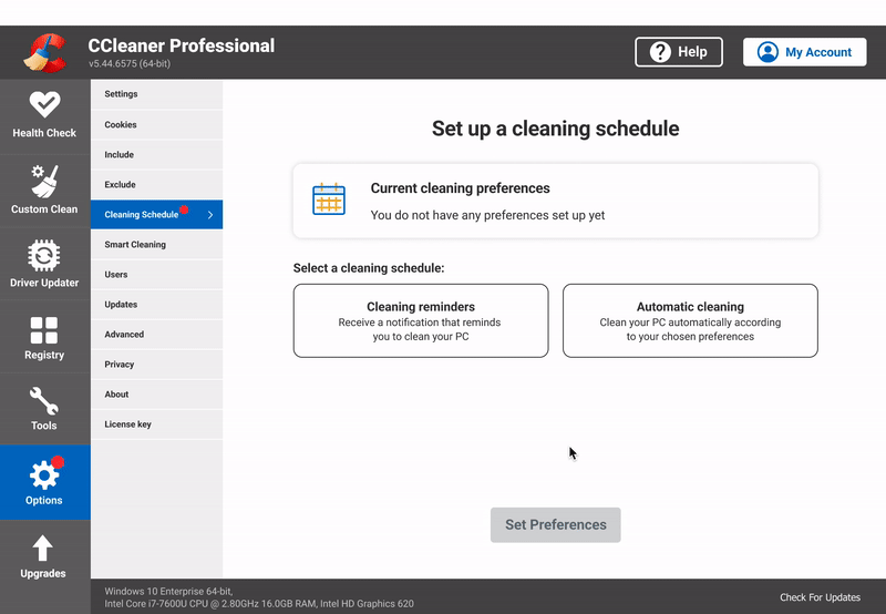
Cleaning Schedule
Redesigning an existing tool

High-level goals
From a user perspective, allow our Free and Pro users to schedule a cleaning reminder or automatic cleaning. (The previous " Scheduler " feature was exclusively available to the CCleaner Pro users).
From a business perspective, highlight and communicate about the tool to our users. And add value to the CCleaner Pro plan to increase the conversion rate and renewal to CC Professional.
SOLUTION
Increase the reachability/discoverability of the feature.
Simplify the process of setting up a cleaning schedule.
Include an additional comparable feature that CC Free users could use.
The existing “Scheduler” tool analyse
Understanding the flow, each screen's options and actions, to list what is necessary to keep, update or improve.

The current “Scheduler” user experience analyses allowed us to list the main flow issues:
Lack of clear communication and guidance:
- The scheduler tool is not easily accessible.
- Access from a second-level menu in the app
- High cognitive load with too much information on the page, which looks messy.
- Lack of hierarchy information on the home screen
- Lack of feedback from the feature when a scheduled clean was being run
The tool is not straightforward:
- Lack of guidance and transparency on where to start and what to do
The tool is not based on User needs:
- The “Monthly” schedule cleaning is selected by Default even though most users choose a daily schedule.Lack of accessibility:
- Contrast and accessibility issues

- USER FEEDBACK -
A survey helped the team to understand the main user’s problems.
Based on their feedback, we brainstormed the new functions and listed the milestones to update the Scheduler feature successfully.

- USER’S CLEANING SCHEDULE USAGE -
Every day 50% of our users clean their PC. So based on the survey results, the “Daily” selection will be selected by default.

- ROADMAP -
Listing and planning each milestone with the team.

- HEART METRICS -
Our product's goals are analysed with a set of five core metrics based on: Happiness, Engagement, Adoption, Retention, and Task success.
Design Process Overview

Main improvement:
Implement a new design pattern to guide the user and reduce the load of details from the home screen. This new pattern helps the user to focus on each step and avoid confusion.

- USER FLOW -
Validating the main point of action.

- LOW-FI WIREFRAMES -
Determining the first UX patterns.

- HIGH-FI WIREFRAMES -
Finalising the flow, UI style and UX patterns.
UX/UI improvements
Simplified flow, broken down into 2-3 steps to accompany the user through each one.
By default, our users most commonly use the chosen option: Daily.
Give more control to the users. By giving them the ability to choose to be notified or not when cleaning is about to start and/or has been completed.
Cleaning data is communicated to the users in a toaster when cleaning has been started and/or completed.
Extend the tool to the CCleaner Free users. Schedule reminders when to do a cleaning.

- DESIGN ITERATIONS -
Listing all changes for a transparent communication with the team.
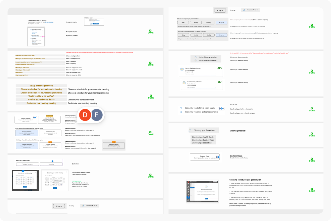
- UPDATES & EXPLANATIONS LIST -
Communicating the design updates to the devs.

- COMPONENTS -
The components created with variants are reused across the screen versions and flow.
They help to develop and efficiently manage the design consistency across the project.
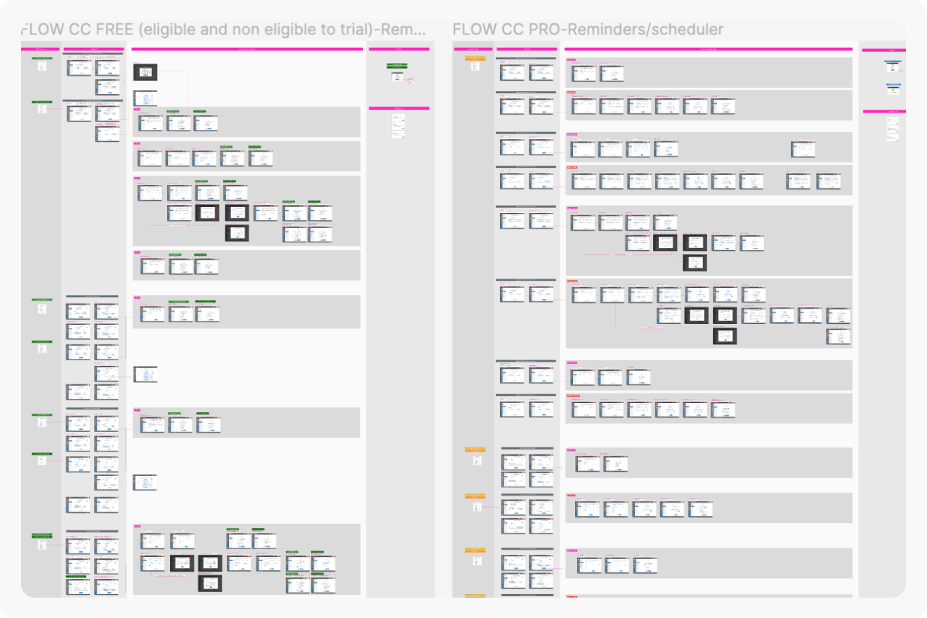
- FINAL FLOW AND DESIGN -
Creating the flows for each CCleaner plan: Free, Professional, and Business.
Implementing a new design pattern TO GUIDE OUR USERS
Each selection step appears as soon as a choice has been made by the user.
This design pattern will guide the user and help him to focus on each step and validate the best option.